
Client - Great Bitter
Brief - Create a piece of striking branding which elevates traditional British bitter so that it can compete with the new craft lagers.
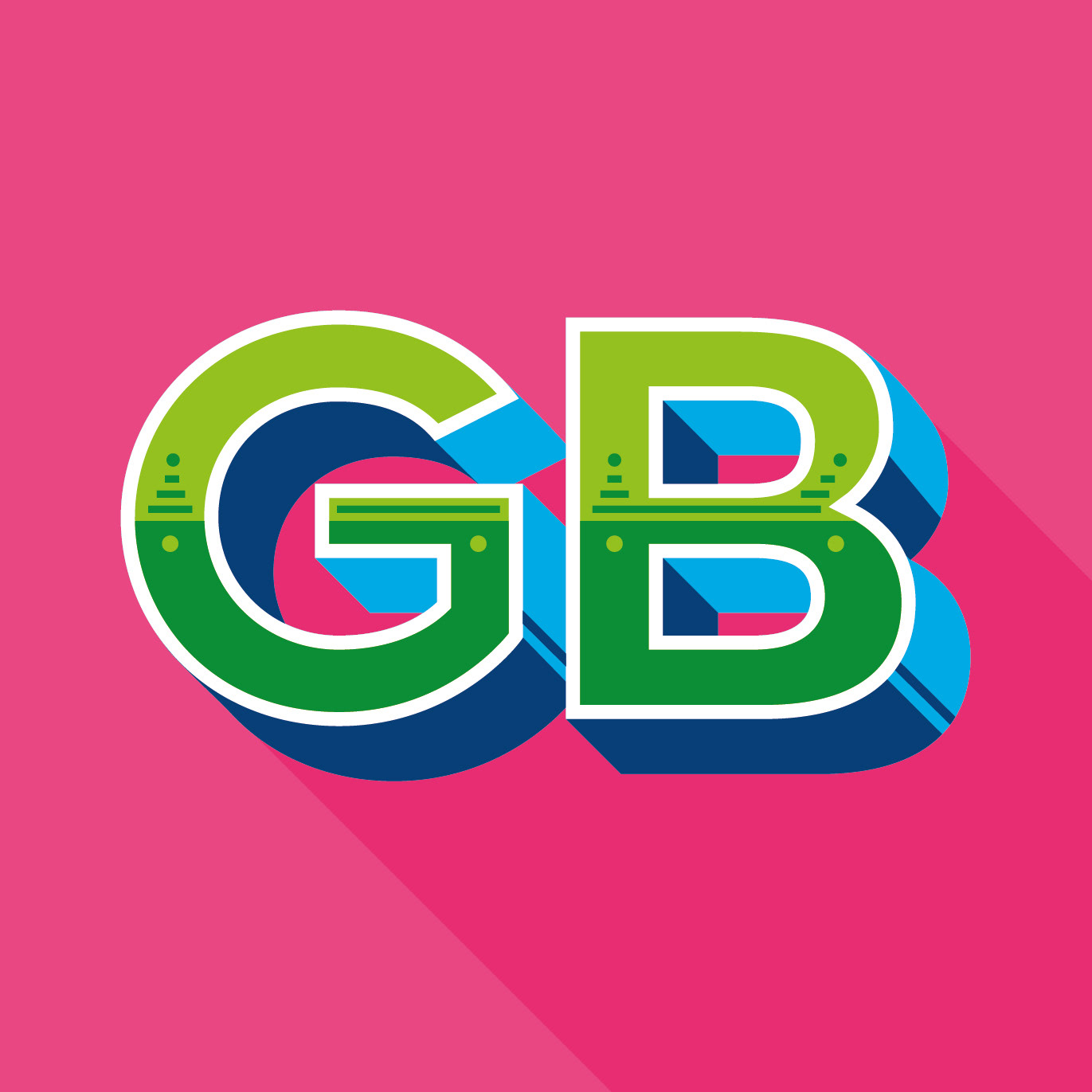
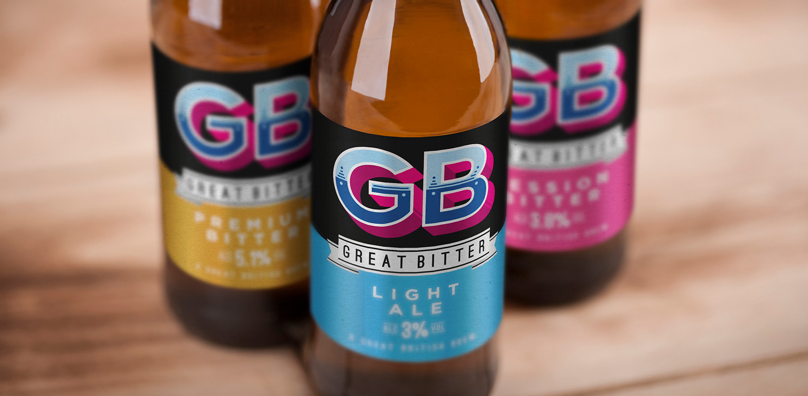
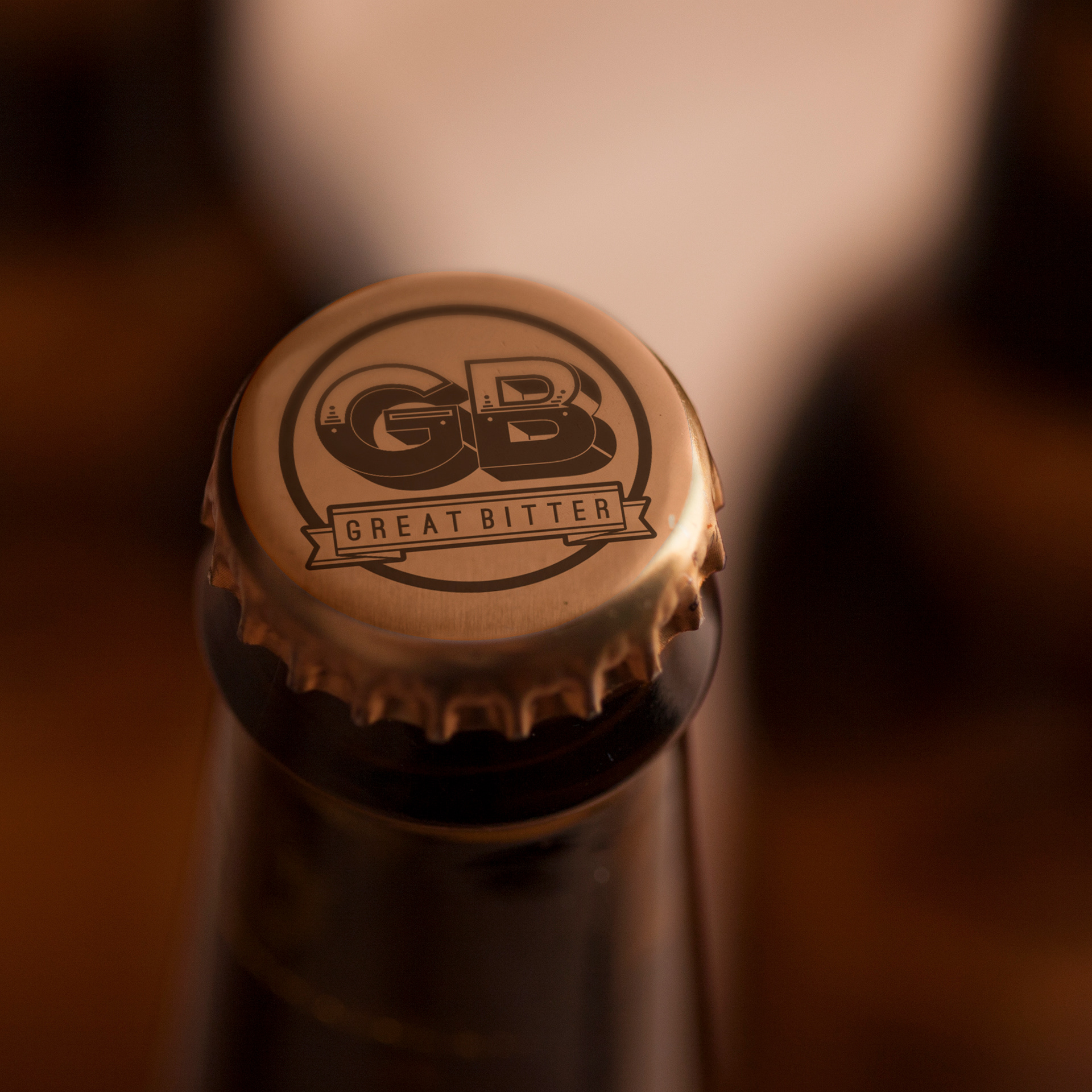
Outcome - A striking and dynamic piece of branding and packaging which stands out in a crowded shelf space. The logo evolves and changes whilst keeping a strong brand feel. It was important to develop a brand mark that was so iconic it would feel consistent even with a constantly changing colour palette. The brand combines bright contemporary colours with a traditional piece of typography evocative of old pub signs.